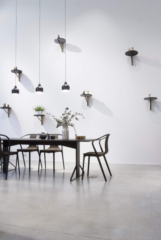
Modern homes thrive on light, proportion, and a sense of ease. Yet the difference between a space that looks merely “done” and one that feels truly lived-in often comes down to art. The right pieces don’t just decorate; they set the mood, anchor the layout, and tell your story.
In today’s interiors, three directions pair beautifully: coastal quietude, personal cartography, and cinematic statements. Together, they give you a framework to move from blank walls to a composed, coherent home—calm where you need it, personal where it matters, and confident when the room can take a stronger note.
1) Coastal Quietude: Texture, Light, and Air
Why it Works in Modern Spaces
Coastal art softens sharp lines without clutter. Those bleached timbers, seagrass textures, and painterly seas introduce a low-contrast palette that feels restful under bright, architectural light. Large-format coastal works absorb glare rather than fight it, which keeps the room’s rhythm calm.
What to Choose
- Subjects: misty horizons, dune grasses, shell studies, abstracted seascapes, aerial coastlines.
- Palettes: shell white, driftwood beige, foam grey, sea-glass green, deep Atlantic blue.
- Formats: one oversized canvas above the sofa; a soft diptych for the bedroom; slim verticals in a sunlit hallway.
Framing & Materials
- Frames: pale oak, ash, or painted white; minimal profiles.
- Surfaces: matte or canvas finishes to avoid specular shine; floating frames if you want a whisper of definition.
- Scale rule: If in doubt, go larger—a single 90–120 cm piece often reads calmer than a busy grid of small frames.
Styling Notes
- Pair with linen upholstery, bouclé throws, and jute or sisal rugs.
- Lighting should be diffuse and warm (2700–3000K) to keep the palette gentle.
- Keep accessories but tactile: a travertine bowl, a ceramic vessel, a fossil or coral form (ethically sourced).
Explore coastal art: For curated, not-kitschy pieces, browse Salt & Sol’s coastal wall art—strong on serene abstracts and shoreline photography that sit effortlessly in modern rooms.
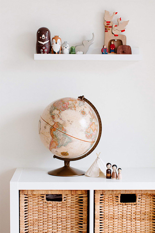
2) Personal Cartography: Art That Charts Your Life
Why it Belongs in a Modern Home
Contemporary interiors prize meaning over excess. A map—especially one you’ve lived—offers geometry and narrative in equal measure. It’s graphic enough to suit clean lines, and intimate enough to matter. A personalised push-pin map adds an interactive layer: milestones plotted, future trips planned, memories recorded.
Design Choices
- Base style: minimal cartography with fine lineweights and quiet labels; choose high-contrast black or mid-tone warm grey for type.
- Colour strategy: keep the map neutral and use pins as your accent palette (two complementary colours, max three).
- Typography: sans-serif for a modern feel; a restrained serif if your home leans classic-modern.
Where to Place it
- Dining nook: conversation starter without visual noise.
- Home office/study: keeps purpose and memory front-of-mind.
- Entry wall: instantly personal without feeling private.
Format & Framing
- Canvas for softness, framed print for crispness.
- Consider anti-reflective glazing if opposite a bright window.
- Sit at eye level: artwork centre roughly 145–150 cm from the floor.
Start your own: For clean, ready-to-hang options (custom text, colours, sizes), see Personalised Push Pin Maps at Canvas Prints Perth.
Side note: A Quietly Personal Alternative
If you like the narrative feel of maps but want something even more intimate, a personalised star map captures the exact night sky from a meaningful moment, think a wedding, a first home, or a baby’s birth.
Rendered with minimalist constellations and crisp typography, it reads as modern graphic art at a glance, with deeper sentiment on closer look. In clean frames (oak, white or matte black) it sits beautifully beside coastal pieces and city maps, giving your wall story a gentle, celestial chapter.
How to Style it Without Shouting
Keep the palette restrained—ink on soft white or deep midnight with a single accent line—and let your inscription carry the emotion. Bedrooms, nurseries and entryways suit star maps best: somewhere you pause rather than pass. If you’d like a refined, made-to-order option, explore personalised star maps from your preferred custom provider (you can link here to Star Maps Australia if you wish).
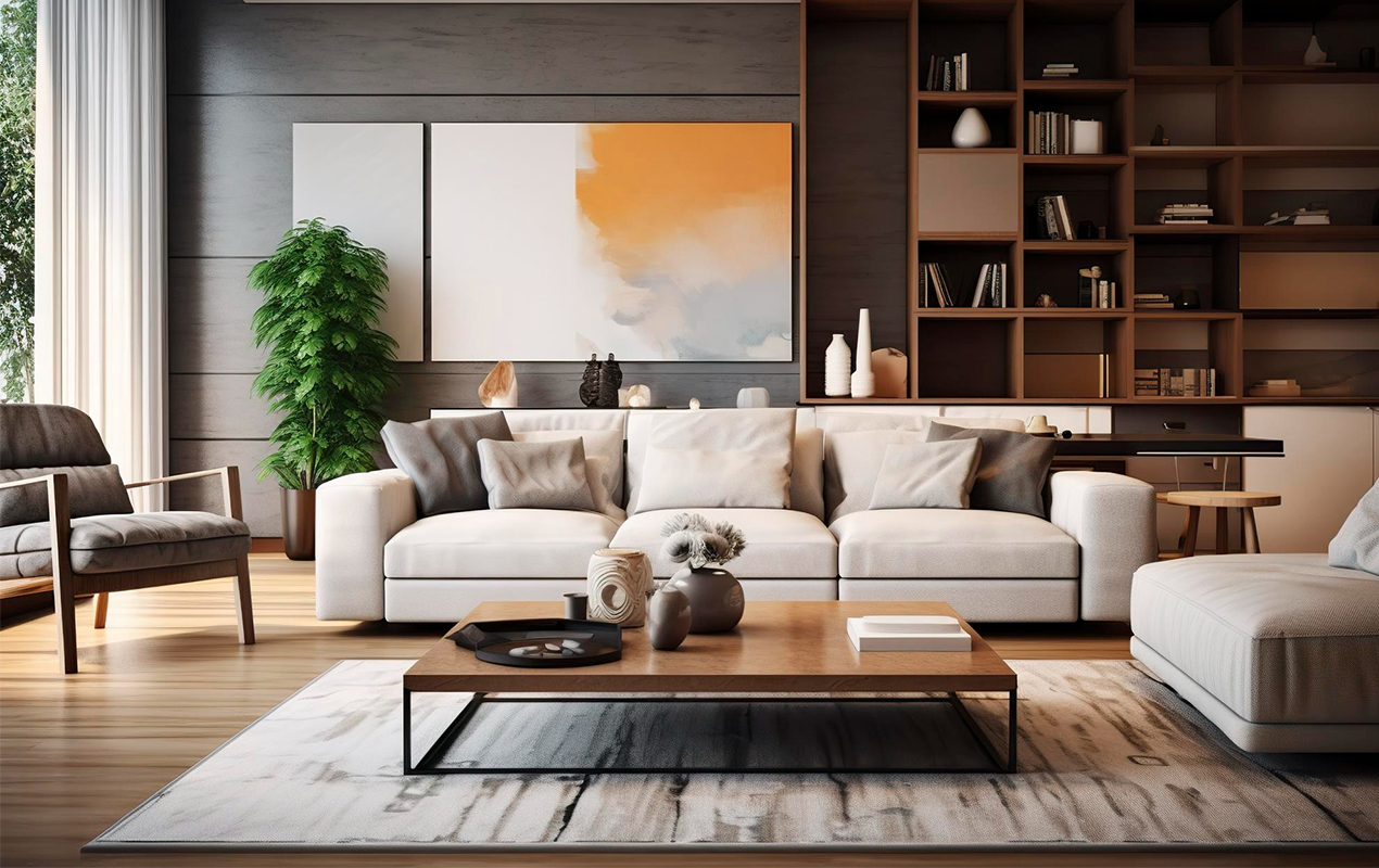
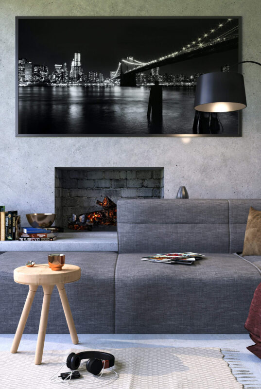
3) Cinematic Statements: Graphic Energy with Grown-Up Restraint
Why Cinema Works Now
Film posters carry built-in design language—iconic typography, bold colour blocks, and instantly recognisable imagery. In measured doses, they’re a brilliant counterpoint to the softness of coastal pieces and the precision of maps.
How to Keep it Refined
- One statement per zone. Treat it like a design object, not a collage.
- Palette discipline: pull 2–3 tones from the poster into cushions, a side chair, or a lamp base.
- Framing: black or brushed metal; generous white borders if you’re using a mount; consider UV-safe glazing for vibrant inks.
Where to Use
- Media room/den: obvious fit; keep furniture lines simple so the poster leads.
- Hallway or stair landing: strong verticals lift transitional spaces.
- Dining room: one large, graphic piece feels gallery-like and unexpected.
Making the Three Directions Work Together
One Hero per Sightline
Stand at the main vantage point (sofa, entry, dining chair). Do you see more than one focal art piece at once? If so, reduce to a single hero per view. Let corridors and door frames provide the “breathing space” between stories.
Frame Cohesion
Even as content changes, a common frame profile ties the home together. Try: pale wood for coastal zones; matte black for cinema; choose one of those two for maps to bridge the styles.
Echo, Don’t Copy
Repeat a colour or material across rooms rather than repeating the same artwork format. Sea-glass green in the living room can reappear as map pins in the study; the noir black of a film title can inform a dining pendant or side table leg.
Scale and Proportion
A modern room often feels calmer with fewer, larger works. As a rough guide:
- Above a 2.1–2.4 m sofa: 60–75% of the sofa width.
- Above a console: leave 10–20 cm either side; 15–20 cm between top of console and frame.
Lighting
- Use wall washers or adjustable spots to graze texture on canvas.
- Keep colour temp warm (2700–3000K); aim for CRI 90+ so colours render accurately.
- Avoid placing glass-glazed pieces opposite big windows—move them to a side wall or use non-reflective glazing.
Room-by-Room Recipes
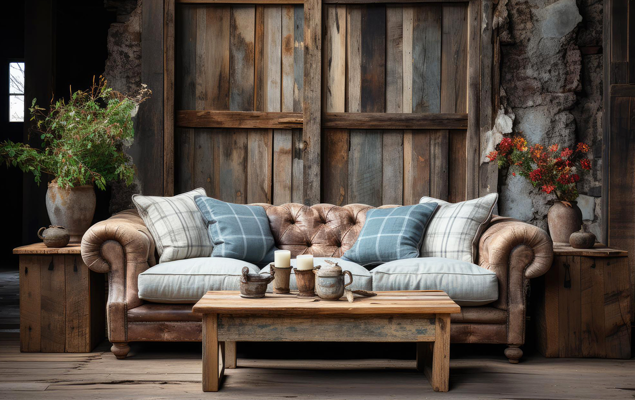
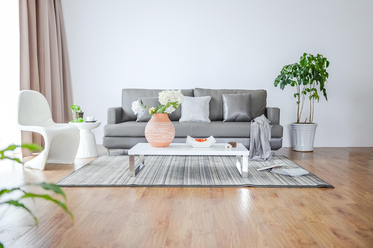
Living Room — Calm Anchor
- One large coastal canvas (100–120 cm) centred above the sofa.
- Palette: shell, fog, sea-glass; a single deep-blue cushion as a quiet echo.
- A travertine side table and linen throw finish the softness.
Study — Your Storyboard
- A framed personalised push-pin map in neutral tones; two pin colours only.
- Keep the desk minimal; add a small shelf for travel mementoes.
- Pin future trips top-right to keep the composition feeling uplifted.
Hallway — Rhythmic Transit
- A tall, narrow cinematic poster with generous borders.
- Black frame; repeat black in a slim console or wall hooks.
- A small uplight creates drama without glare.
Bedroom — Restful Layers
- A gentle coastal diptych above the bed (two 60–70 cm pieces).
- Bedlinen in chalk and oat; an oak bench to tie frame and timber tones.
- Sheer curtains to control light and protect pigments.
Colour Pairings to Steal
- Coastal Set: Oyster (walls), Driftwood (timber), Sea-Glass (accent), Midnight (pin-stripe or lamp).
- Map Set: Paper White (background), Pewter (type), Burnt Ochre & Teal (pins).
- Cinema Set: Porcelain (walls), Ink (frames), Vermilion or Mustard (single accent), Smoke (textiles).
Common Mistakes (and Easy Fixes)
- Too many small frames: Replace with one larger piece; the room will feel calmer.
- Mismatched frame depths: Standardise on one or two profiles for visual order.
- Glare: Swap glossy for canvas/matte, or move the piece 90° to the window.
- Unclear sightlines: Step back and edit; each view deserves one focal idea.
Sustainability & Care (Quiet Luxury Details)
- Prefer FSC-certified timbers and water-based inks.
- Choose archival substrates (acid-free papers; quality canvases) for longevity.
- Dust frames with a soft microfibre; avoid household sprays on glazing—use a lens-safe cleaner lightly on a cloth.
Budget Tiers (Plan Your Spend Without Compromise)
- Anchor (Invest): One large coastal canvas or a hero cinematic print with premium framing.
- Story (Mid): Personalised push-pin map in a quality frame; anti-reflective glazing if opposite light.
- Texture (Save): Linen cushions, jute rug, ceramic vessel; these amplify the art without a demanding budget.
You can also Read About: Reasons Comfort Should Be a Priority at Home
A Weekend Action Plan
Saturday AM
- Measure walls; choose one hero per key zone.
- Set your palette trios (coastal, map, cinema).
- Shortlist 5–7 artworks that fit those palettes.
Saturday PM
- Order frames or select framing options.
- Plan lighting (add one wall washer if needed).
Sunday
- Hang at eye level (centre at ~145–150 cm).
- Style with two tactile accents (max) per zone.
- Live with it for a week, then adjust spacing or height by 2–3 cm if something feels “off”.
Where to Start (Curated, Quiet Mentions)
With these three directions—coastal quietude, personal cartography, and cinematic statements—you can shape a modern home that feels composed yet personal: calm where you want to exhale, storied where you pause to remember, and bold where life happens loudest.
DeCasa Collections shares stylish and cozy home décor ideas that make every space warm and inviting.